
I’ve always had a slight fascination with the Crypto world despite not really understanding what’s going on over there. I was therefore quite excited to come across CryptoWatch, a crypto markets platform that provides a live stream of Crypto transactions.
It seemed like a good fit for an Apache Pinot demo and I thought I’d also take the chance to build something using Dash, a low-code framework for building data apps built by the people behind plotly.
What is Dash?
Dash is a low-code framework, built on top of Plotly.js and React.js, for rapidly building data apps in Python, R, Julia, and F#. It provides some nice abstractions that make it easy to build a full-stack web app with interactive data visualization.
What is CryptoWatch?
Cryptowatch is a real-time crypto markets platform. It lets you connect to global crypto markets and offers a real-time WebSocket API for streaming normalized cryptocurrency market data.
An example of an event published by this API is shown below:
{ "marketUpdate": { "tradesUpdate": { "trades": [ { "timestamp": "1649776468", "priceStr": "106.22", "amountStr": "1", "timestampNano": "1649776468794000000", "externalId": "SOLUSDT:246614342", "orderSide": "SELLSIDE" } ] }, "market": { "exchangeId": "27", "currencyPairId": "177305", "marketId": "136116" } } }Code language: JSON / JSON with Comments (json)Trades
CryptoWatch also has HTTP APIs that describe the lookup data used by the trades returned by the WebSocket API.
They include exchanges, which describe the exchange where the trade was done:
{"id":2,"symbol":"coinbase-pro","name":"Coinbase Pro","route":"https://api.cryptowat.ch/exchanges/coinbase-pro","active":true}Code language: JSON / JSON with Comments (json)Exchanges
Pairs, which describe a base and quote traded on an exchange:
{"id":180266,"base":5478,"baseSymbol":"10set","baseName":"Tenset","quote":77,"quoteSymbol":"eth","quoteName":"Ethereum"}Code language: JSON / JSON with Comments (json)Pairs
A base is the asset being bought or sold and a quote is the asset being used to make the purchase/sale.
And finally markets, which describe a pair listed on an exchange:
{"id":1,"exchange":"bitfinex","pair":"btcusd","active":true,"route":"https://api.cryptowat.ch/markets/bitfinex/btcusd"}Code language: JSON / JSON with Comments (json)Markets
CryptoWatch is a good dataset for demonstrating Pinot because it has a high velocity for an open dataset. In my time working with it, there have been between 1,000 and 3,000 events published every second.
It’s a paid API, but they give you enough free credits to play around with.
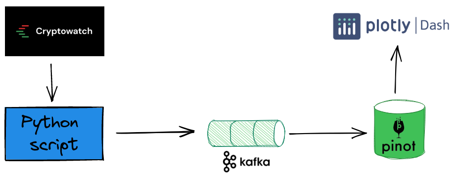
Architecture
The diagram below shows how the data flows from the CryptoWatch WebSocket API into Pinot via Kafka, and then finally to Dash:
Pinot table/schema
Next let’s have a look at our Pinot schemas and tables. We have the following:
- trades real-time table that captures the transactions from CryptoWatch’s WebSocket API.
- exchanges , pairs , and markets offline dimension tables that store lookup data.
The diagram below shows the relationships between these schemas:
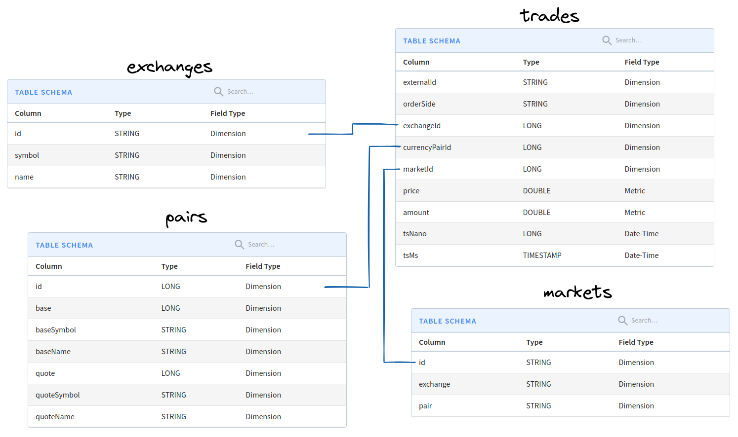
Pinot supports lookup joins using the Lookup UDF Join. This function lets us lookup data from a dimension table to decorate the results of a query.
Dimension tables are stored in on-heap memory, so they must be small in size. We are using them for static data, which is a good fit.
Our dimension tables have the following number of rows/sizes:
- exchanges – 44 rows / 3.71 KB
- pairs – 11,853 rows / 433.27 KB
- markets – 16,663 rows / 590.86 KB
You can find instructions for configuring these tables and schemas in the README of the GitHub repository.
Setup Python environment
Let’s now setup our Python environment, which we’ll use to query CryptoWatch, ingest data into Kafka, and build our Dash app. I always like to work with a localised Python environment, so let’s first create one using venv :
python -m venv .venv source .venv/bin/activeNext we need to install the libraries that we’re going to use:
pip install pinotdb dash cryptowatch-sdk confluent-kafkaPolling CryptoWatch
It’s time to query CryptoWatch!
First, let’s create an API key to query CryptoWatch. We’ll then configure that key as an environment variable:
export KEY="<cryptowatch-api-key>"Code language: JavaScript (javascript)Next add the following code to a file called crypto.py :
import cryptowatch as cw import os from google.protobuf.json_format import MessageToJson cw.api_key = os.environ.get("KEY") cw.stream.subscriptions = ["markets:*:trades"] def handle_trades_update(trade_update): message = MessageToJson(trade_update) print(message) cw.stream.on_trades_update = handle_trades_update cw.stream.connect()Code language: JavaScript (javascript)If we run this script by executing python crypto.py , we’ll see a stream of trades similar to the one described at the beginning of the post. Each document defines one market, but potentially multiple trades.
We’ll then write these trades into the Kafka trades topic. We won’t go through the code showing how to do that in this blog post, but you can find the code in stream.py in the accompanying repository.
Building the dashboard
Now it’s time to build our dashboard. Let’s create a file called dashboard_v1.py and import the following libraries:
import pandas as pd from dash import Dash, html, dash_table from pinotdb import connectCode language: JavaScript (javascript)Next, we’ll instantiate our Dash app:
external_stylesheets = ['https://codepen.io/chriddyp/pen/bWLwgP.css'] app = Dash(__name__, external_stylesheets=external_stylesheets) app.title = "Crypto Watch Real-Time Dashboard"Code language: JavaScript (javascript)Version 1: Data Tables
For the first version of the dashboard, we’re going to display data from Pandas DataFrames. We’ll use the following functions to convert those DataFrames into Dash DataTables:
def as_data_table_or_message(df, message): return as_datatable(df) if df.shape[0] > 0 else message def as_datatable(df): return dash_table.DataTable( df.to_dict('records'), [{"name": i, "id": i} for i in df.columns] )Code language: JavaScript (javascript)Create a connection and cursor to query Pinot:
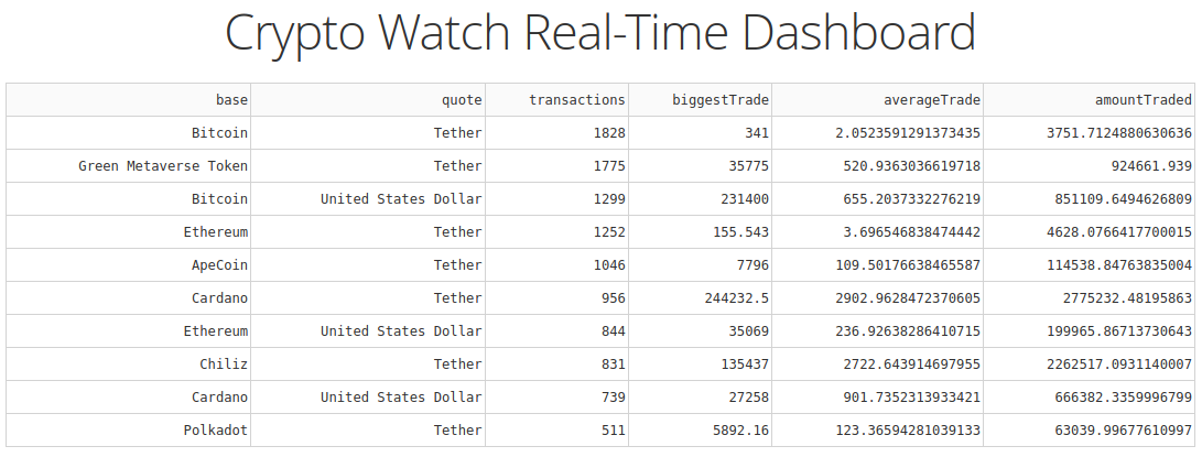
connection = connect(host="localhost", port="8099", path="/query/sql", scheme=( "http")) cursor = connection.cursor()Code language: JavaScript (javascript)Next we’ll write a query that finds the most trades pairs in the last 30 minutes:
cursor.execute(""" select lookUp('pairs', 'baseName', 'id', currencyPairId) AS base, lookUp('pairs', 'quoteName', 'id', currencyPairId) AS quote, count(*) AS transactions, max(amount) as biggestTrade, avg(amount) as averageTrade, sum(amount) AS amountTraded from trades where tsMs > ago(%(intervalString)s) group by quote, base order by transactions DESC limit 10 """, {"intervalString": f"PT30M"}) pairs_df = pd.DataFrame(cursor, columns=[item[0] for item in cursor.description]) pairs = as_data_table_or_message(pairs_df, "No recent trades") cursor.close()Code language: JavaScript (javascript)And finally let’s create a layout for the page and start running the app:
app.layout = html.Div([ html.H1("Crypto Watch Real-Time Dashboard", style={'text-align': 'center'}), html.Div(id='content', children=[ pairs ]) ]) if __name__ == '__main__': app.run_server(debug=True)Code language: PHP (php)If we navigate to localhost:8050, we’ll see the following:
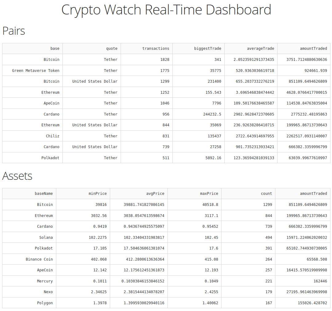
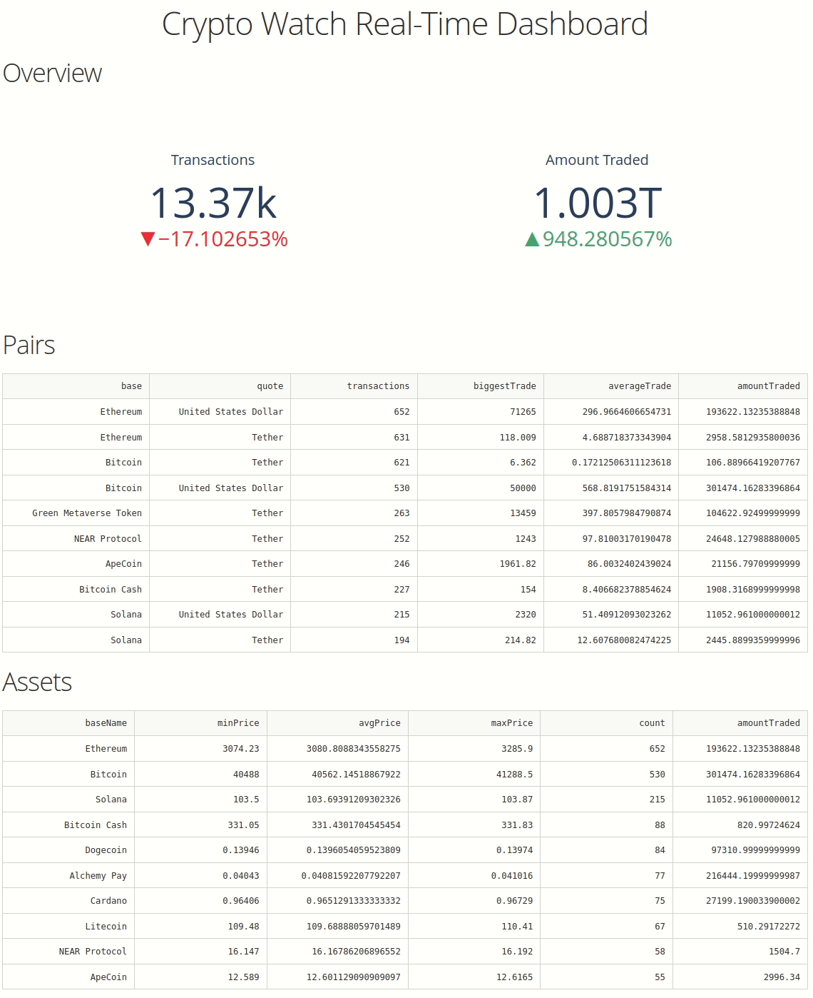
Let’s also add a table that shows the most traded assets bought or sold using US Dollars, which we can do with the following code:
cursor.execute(""" select lookUp('pairs', 'baseName', 'id', currencyPairId) AS baseName, min(price) AS minPrice, avg(price) AS avgPrice, max(price) as maxPrice, count(*) AS count, sum(amount) AS amountTraded from trades WHERE lookUp('pairs', 'quoteName', 'id', currencyPairId) = 'United States Dollar' AND tsMs > ago(%(intervalString)s) group by baseName order by count DESC """, {"intervalString": f"PT30M"}) assets_df = pd.DataFrame(cursor, columns=[item[0] for item in cursor.description]) assets = as_data_table_or_message(assets_df, "No recent trades")Code language: JavaScript (javascript)And now let’s update the Dash App layout to include this DataTable:
app.layout = html.Div([ html.H1("Crypto Watch Real-Time Dashboard", style={'text-align': 'center'}), html.Div(id='content', children=[ html.H2("Pairs"), pairs, html.H2("Assets"), assets ]) ])Code language: JavaScript (javascript)We’ll also add a bit of padding to the cells in the DataTable, which you can see in dashboard_v1.py If we go back to our web browser, the dashboard will automatically refresh, and we’ll see the following:
So far, so good.
Version 2: Indicators
In version 2 of the dashboard we’re going to add some indicators. Indicators are used to visualize single values and they can also be used to compute the delta of these values as well. The screenshot below shows what an indicator looks like:
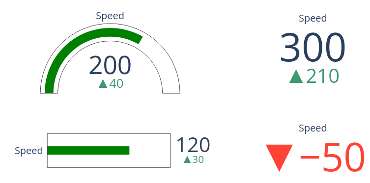
We can use indicators to see what’s happening with the data in this interval vs the previous interval. For example we can track the number of transactions done in the last minute compared to the minute before that.
We’re going to need some new imports, so let’s configure those:
from dash import dcc import plotly.graph_objects as goCode language: JavaScript (javascript)We’ll also create a couple of functions to help us construct the indicators:
def add_delta_trace(fig, title, value, last_value, row, column): fig.add_trace(go.Indicator( mode = "number+delta", title= {'text': title}, value = value, delta = {'reference': last_value, 'relative': True}, domain = {'row': row, 'column': column}) ) def add_trace(fig, title, value, row, column): fig.add_trace(go.Indicator( mode = "number", title= {'text': title}, value = value, domain = {'row': row, 'column': column}) )Code language: PHP (php)We’ll use add_delta_trace when we have data for the current and previous intervals, but if we only have data for the current interval we’ll use add_trace .
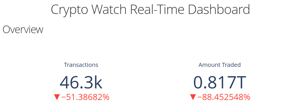
We can construct indicators that show the total number of transactions and amount of assets traded in the last minute with the following code:
interval = 1 cursor.execute(""" select count(*) AS count, sum(amount) AS amountTraded from trades WHERE tsMs > ago(%(intervalString)s) order by count DESC """, {"intervalString": f"PT{interval}M"}) aggregate_trades_now = pd.DataFrame(cursor, columns=[item[0] for item in cursor.description]) cursor.execute(""" select count(*) AS count, sum(amount) AS amountTraded from trades WHERE tsMs < ago(%(intervalString)s) AND tsMs > ago(%(previousIntervalString)s) order by count DESC """, {"intervalString": f"PT{interval}M", "previousIntervalString": f"PT{interval*2}M"}) aggregate_trades_prev = pd.DataFrame(cursor, columns=[item[0] for item in cursor.description]) fig = go.Figure(layout=go.Layout(height=300)) if aggregate_trades_now["count"][0] > 0: if aggregate_trades_prev["count"][0] > 0: add_delta_trace(fig, "Transactions", aggregate_trades_now["count"][0], aggregate_trades_prev["count"][0], 0, 0) add_delta_trace(fig, "Amount Traded", aggregate_trades_now["amountTraded"][0], aggregate_trades_prev["amountTraded"][0], 0, 1) else: add_trace(fig, "Transactions", aggregate_trades_now["count"][0], 0, 0) add_trace(fig, "Amount Traded", aggregate_trades_now["amountTraded"][0], 0, 1) fig.update_layout(grid = {"rows": 1, "columns": 2, 'pattern': "independent"},) else: fig.update_layout(annotations = [{"text": "No transactions found", "xref": "paper", "yref": "paper", "showarrow": False, "font": {"size": 28}}])Code language: PHP (php)We also need to update our app’s layout, as shown below:
app.layout = html.Div([ html.H1("Crypto Watch Real-Time Dashboard", style={'text-align': 'center'}), html.Div(id='content', children=[ html.H2("Overview"), dcc.Graph(figure=fig), html.H2("Pairs"), pairs, html.H2("Assets"), assets ]) ])Code language: JavaScript (javascript)If we go back to our web browser, we’ll see the following:
You can find all the code use in this version of the dashboard in dashboard_v2.py.
Version 3: Auto Refresh
The dashboard that we’ve built so far computes analytics based on real-time data, but the dashboard itself doesn’t automatically refresh with the latest data. That’s the functionality that we’ll add in version 3.
First, a couple of new imports:
from dash import Input, OutputCode language: JavaScript (javascript)And we’ll update our app’s layout to look like this:
app.layout = html.Div([ html.H1("Crypto Watch Real-Time Dashboard", style={'text-align': 'center'}), dcc.Interval( id='interval-component', interval=1 * 1000, n_intervals=0 ), html.Div(id='content', children=[ html.H2("Overview"), dcc.Graph(id="indicators"), html.H2("Pairs"), html.Div(id="pairs"), html.H2("Assets"), html.Div(id="assets"), ]) ])Code language: JavaScript (javascript)Notice that instead of populating the page with DataTables and Indicators, we now have placeholders for that content. We’ve also added a dcc.Interval component with an interval of 1000 , which means it will run a callback function every 1,000 milliseconds.
The callback function is defined below:
@app.callback([ Output(component_id='indicators', component_property='figure'), Output(component_id='pairs', component_property='children'), Output(component_id='assets', component_property='children'), ],[ Input('interval-component', 'n_intervals') ]) def overview(n): interval = 1 cursor = connection.cursor() # ... return fig, pairs, assetsCode language: CSS (css)The callback function takes in one input from the interval-component , which has the value of the n_intervals properties for that component. We’ll ignore that value.
It also returns three outputs for the indicators, pairs, and assets. The component_id used in the Input and Output values must match the id used in the components in the layout, otherwise Dash will throw an error.
The # … is where the rest of the code that we wrote earlier in the post will go. You can find the full code for this version of the dashboard in dashboard_v3.py.
An animation showing how the dashboard looks now is shown below:
In the final version of the dashboard I also added charts and the ability to drill down by asset, as shown in the animation below:
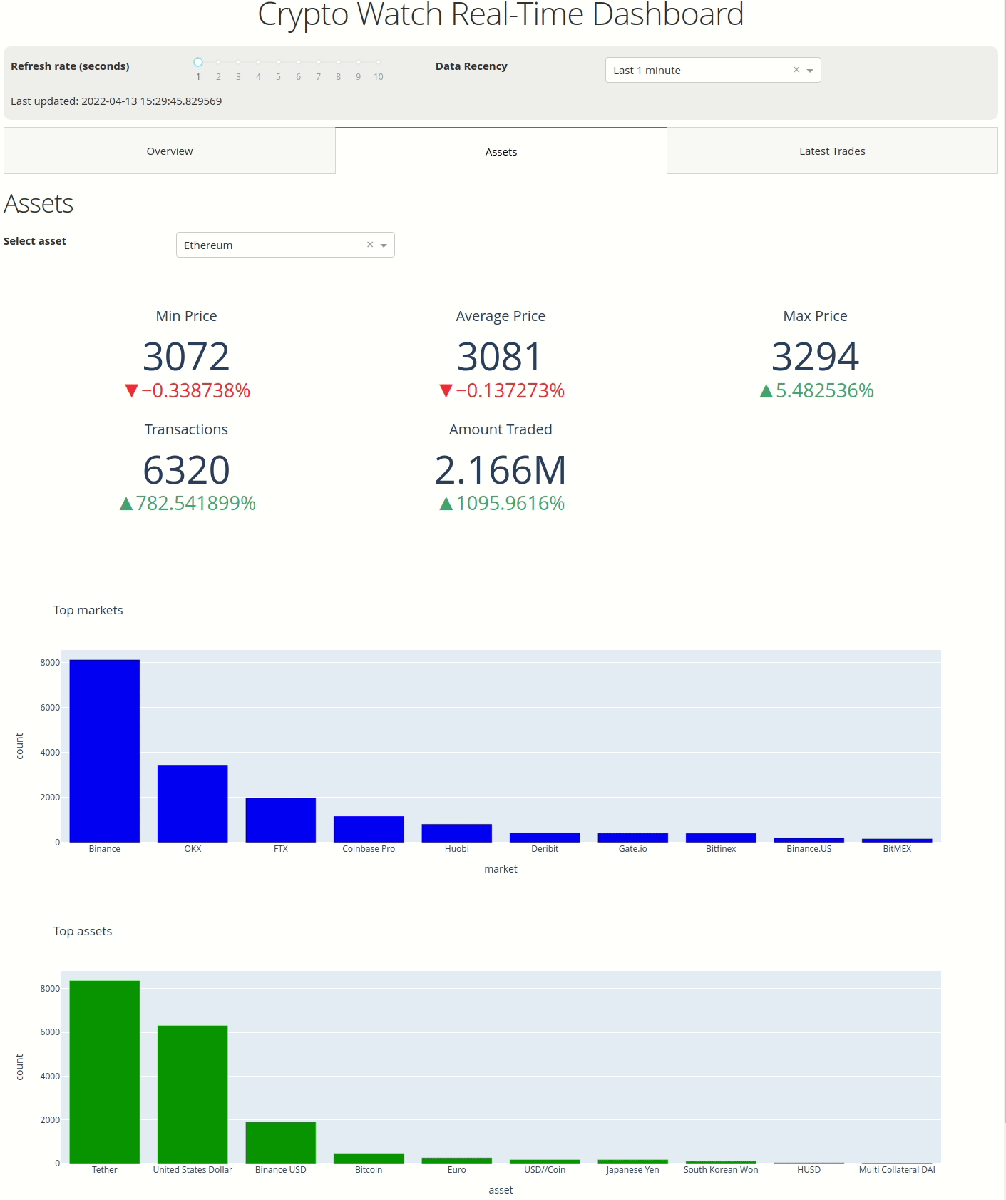
You can find the code for the final version of the dashboard in dashboard.py
Summary
This is my first time using the Dash library. My go-to for this type of project is usually Streamlit.
I think the auto refreshing functionality in Dash is really good for building these types of dashboards. Although we were refreshing all components of the page at the same frequency, it is possible to refresh different components at different intervals or to even not refresh them at all.
The integration with plotly is great as it makes it super easy to create nice looking visualizations.