In this blog post, I’d like to show you how Apache Pinot can be used to easily ingest, query, and visualize millions of climate events sourced from the NOAA storm database.
Bootstrap your climate dashboard
I’ve created an open source example that will fully bootstrap a climate data dashboard with Apache Pinot as the backend and Superset as the frontend. In three simple commands, you’ll be up and running and ready to analyze millions of storm events.
Repository: https://github.com/kbastani/climate-change-analysis
Running the dashboard
Superset is an open source web-based business intelligence dashboard. You can think of it as a kind of “Google Analytics” for anything you want to analyze.
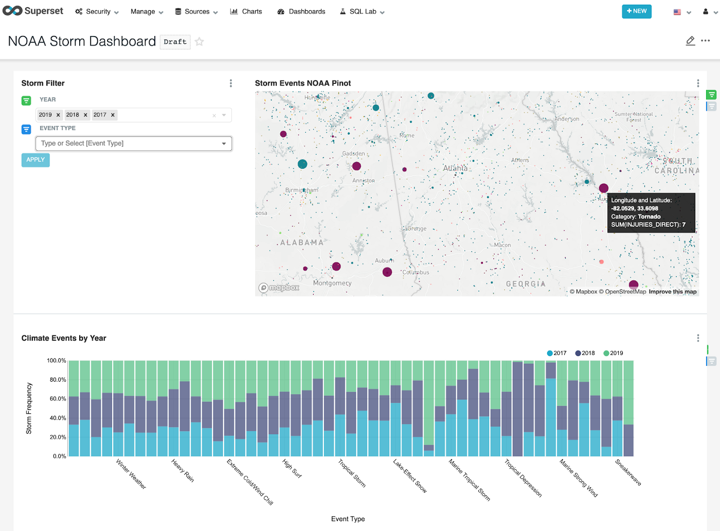
After cloning the GitHub repository for the example, go ahead and run the following commands.
$ docker network create PinotNetwork
$ docker-compose up -d
$ docker-compose logs -f — tail=100
After the containers have started and are running, you’ll need to bootstrap the cluster with the NOAA storm data. Make sure you give the cluster enough time and memory to start the different components before proceeding. When things look good in the logs, go ahead and run the next command to bootstrap the cluster.
$ sh ./bootstrap.shThis script does all the heavy lifting of downloading the NOAA storm events database and importing the climate data into Pinot. After the bootstrap script runs to completion, a new browser window will appear asking you to sign in to Superset. Type in the very secure credentials admin/admin to login and access the climate dashboards.
Analyzing climate data
For this blog post, I wanted to make it as easy as possible to bootstrap a dashboard so that you can start exploring the climate data. Under the hood of this example, there are some interesting things going on. We basically have a Ferrari supercar in the form of a real-time OLAP datastore called Apache Pinot doing the heavy lifting.
Pinot is used at LinkedIn as an analytics backend, serving 700 million users in a variety of different features, such as the news feed. The next blog post in this series will focus just on the technical implementation and architecture.
Source data
The data I’ve decided to use for this dashboard is sourced from the NOAA’s National Center for Environmental Information (NCEI). While there are many different kinds of datasets one might want to use as a dashboard for analyzing climate data, the one I’ve chosen to focus on is storm events.
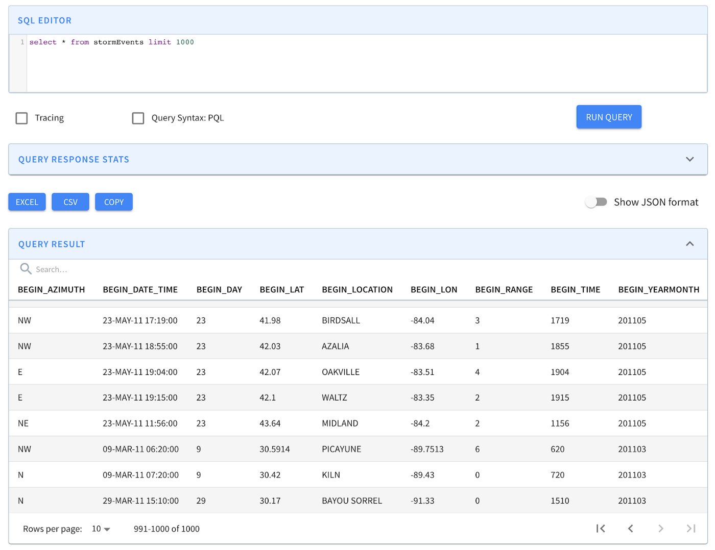
A comprehensive detailed guide of the source data and columns can be found in PDF format here. After running the bootstrap, you can use Apache Pinot’s query console to quickly search through the data, which gives you a pretty good idea about what it contains.
According to the NCEI website, the Storm Events Database is used to generate the official NOAA Storm Data publication, documenting:
- The occurrence of storms and other significant weather phenomena having sufficient intensity to cause loss of life, injuries, significant property damage, and/or disruption to commerce;
- Rare, unusual, weather phenomena that generate media attention, such as snow flurries in South Florida or the San Diego coastal area; and
- Other significant meteorological events, such as record maximum or minimum temperatures or precipitation that occur in connection with another event.
The database contains millions of storm events recorded from January 1950 to May 2020, as entered by NOAA’s National Weather Service (NWS).
Climate change analysis with Superset
With Superset, you can create your own dashboards using Apache Pinot as the datasource. When creating the dashboards included in this example, I could have spent months on creating cool interactive charts, but to start I decided to create just a few.
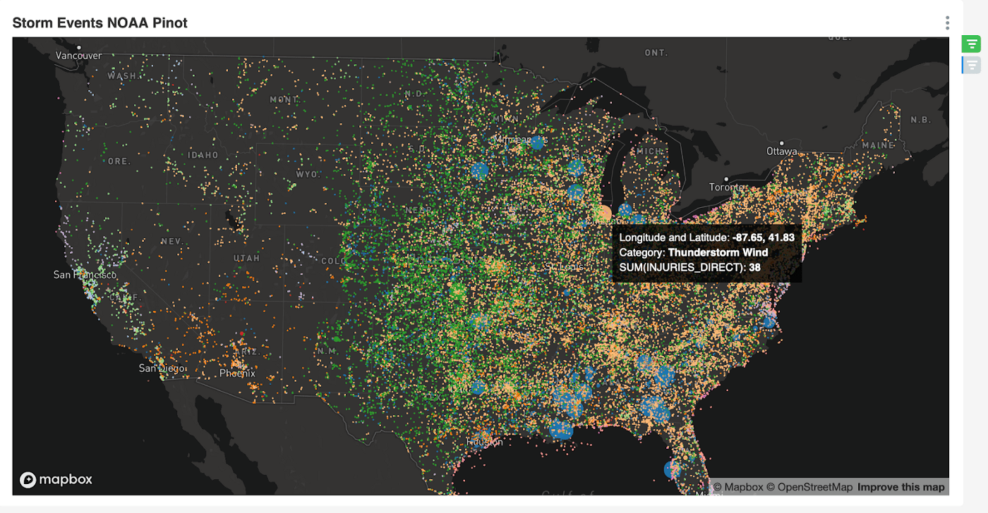
Since the source data contains geolocation coordinates for each storm event, the first thing I thought of visualizing was a map of the US showing all storms since 1950. That was a tad ambitious since there are over 1.6 million storm events.
I decided to implement some yearly filters as well as storm event types. As I played around more with the charting tools in Superset, I figured out how to visualize how many people were injured as a result of each storm event. Below we can see a tornado that injured 30 people, surrounded by many other different types of storms.
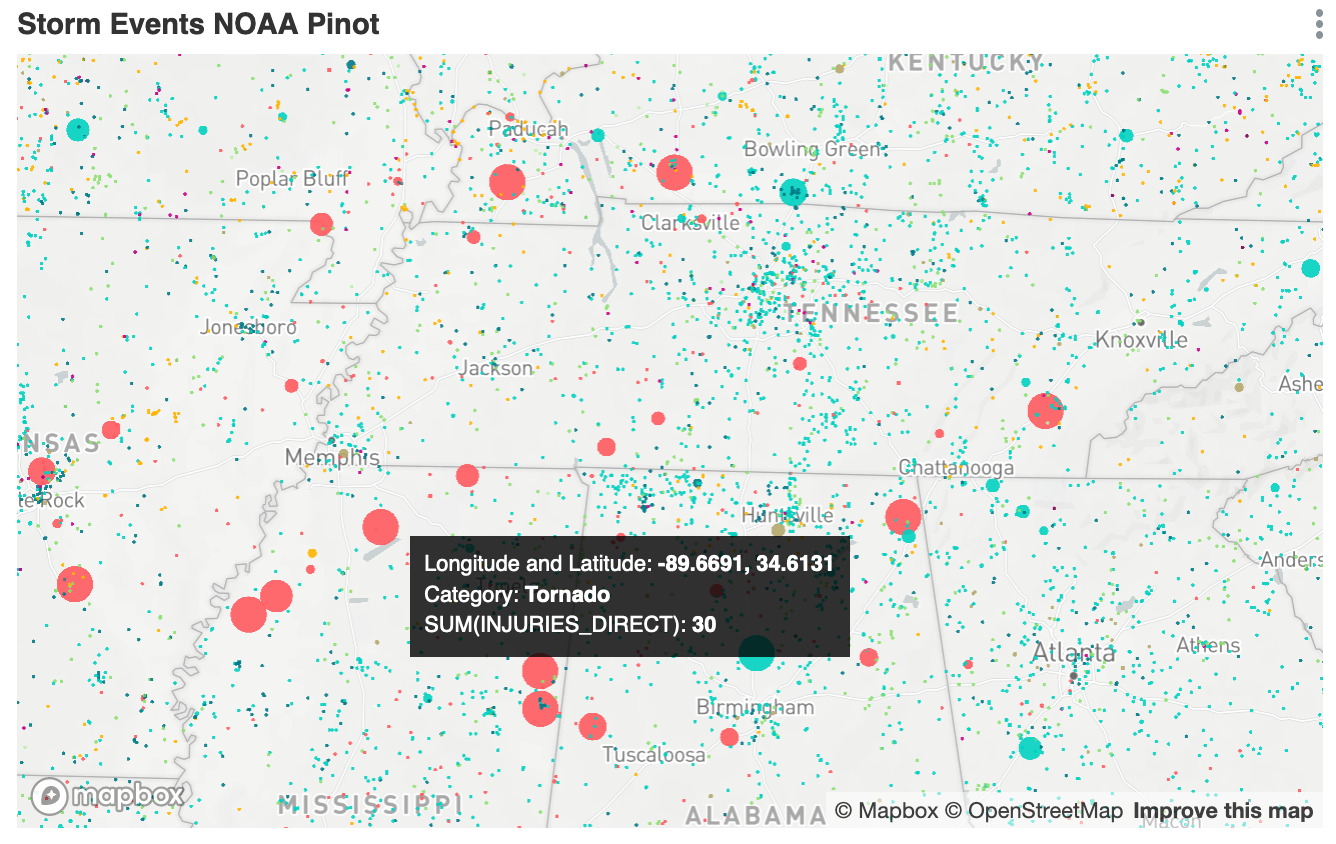
As a part of this dashboard, you can now see how many people were injured in any storm event by geographic location within a time period. The storm map also sizes the points on the map and color codes them based on the magnitude of injuries and the type of storm event. In the screenshot above, we have pink circles representing tornado injuries.
Hail and thunderstorm analysis
If anyone was wondering if data science is actual science, the answer is probably no. I spend time creating open source examples and recipes so others can analyze the data without bothering with all the boring infrastructure and software things. Sometimes during this process of creating examples, it feels good to point at some chart and say something exciting about what I find. I encourage more people to do that, whether or not it is scientific to make such claims. There is so much climate data and ways to visualize how it is changing, I think it’s a whole of civilization and societal responsibility to make interesting discoveries.
Here is one example where I discovered an interesting anomaly in the periodicity and intensity of thunderstorm and hail storm seasons.
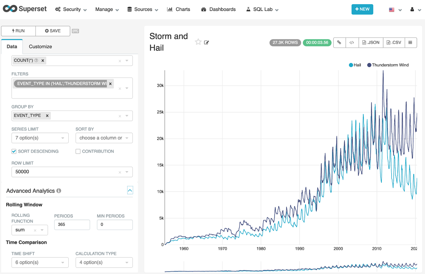
What we are looking at here is over twenty-seven thousand hail and thunderstorm events since 1950. Naturally, the count would be seen to be increasing due to better ways to collect the events by the NWS. I spent some time analyzing this chart to understand the implications of what I was seeing. When hail storms and thunderstorms diverge significantly over the seventy years charted out here, it’s possible that there is a correlation between damaging events such as tornadoes, wildfires, droughts, and heatwaves. I’m glad I was able to find this visualization because it does certainly beg questions that a climate scientist might be able to answer.
Storm frequency and seasonal variability
The next visualization I came up with was to see the storm event variation from season to season over a period of years.
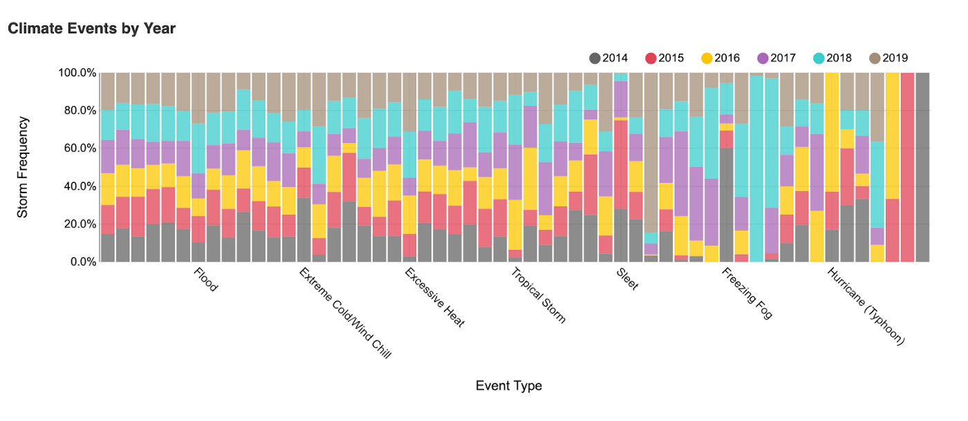
This chart is far more palatable than the last one I showed. If anything, it looks super pretty, while also being quite useful. Here we can quickly see anomalies year to year in the volume of certain types of events. One such example is evidence of increased floods in 2018 and 2019. We also see that both extreme cold and excessive heat have been far more prevalent in the last three years. Overall, when analyzing this chart, if things aren’t lining up nicely in equal proportions, that could potentially be a sign of climate change.
Climate heat map
The last chart I came up with for this blog post was the most interesting for both its visual aesthetic and interpretability.
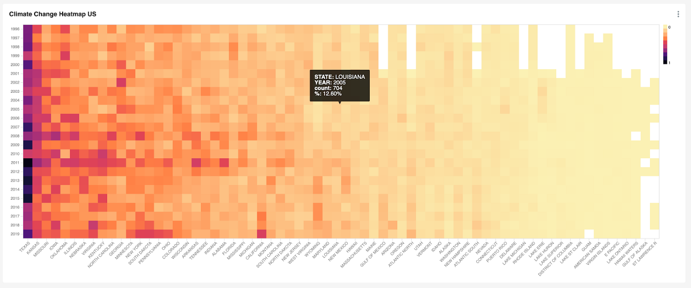
Above, we have the yearly climate events as a heat map that I’ve grouped by US state and region. The very first thing I noticed is that everything is indeed bigger in Texas, even the storms! The next thing I noticed was that California has started to look similar to Texas in the last six years. Another interesting area worth further exploration are the years 2008 and 2011. Both of these two years show an abnormal increase in storm events that affected every US state and region. There is clearly an answer here for why that is, however, it’s worth more exploration using other kinds of analysis. It would be hard to conclude on any cause just by looking at this chart.
Heat maps like this are great for identifying things to investigate, rather than making any conclusions.
Conclusion
As a part of this project, I wanted to take the opportunity to craft an example for folks while also teaching myself more about climate change. I’ve found that there is so much to this subject.
Often, I see folks on Twitter toss around the terms climate change and global warming as if these things were as easy to understand as watching one or two documentaries on Netflix. Creating this dashboard gave me an opportunity to understand the hard work that goes into creating both the science and infrastructure necessary to analyze climate data.
Climate change is a broad topic, and global warming is just one part of it. The climate is always changing, and it always has been. Some of the world’s hottest and most arid deserts in Africa used to be lakes. The world today may have never been as hospitable to our lifestyles a it is today. What climate scientists spend their time on is understanding the history of climate change so that they can predict future damage to the many different ecosystems hosting biological life around our world.
Extreme weather events, ones that have a recurring frequency, like hurricanes and tornadoes, happen more or less frequently in areas depending on climate events. When a sudden and unpredicted climate event happens, it may cost billions of dollars and result in many injuries and deaths.
Next steps
Thanks for reading! Stay tuned for the next blog post that dives deep into the technical bowels of this example to understand how OLAP datastores like Apache Pinot work.
Please share this blog post on social media to get the word out about climate science and climate change. Also, if you’re a scientist and want to work on doing some innovative climate research using Apache Pinot, please reach out to me. I’d love to help.
More Resources:
- Join our Slack channel: https://communityinviter.com/apps/apache-pinot/apache-pinot
- See our upcoming events: https://www.meetup.com/apache-pinot
- Follow us on Twitter: https://twitter.com/startreedata
- Subscribe to our YouTube channel: https://www.youtube.com/startreedata
